
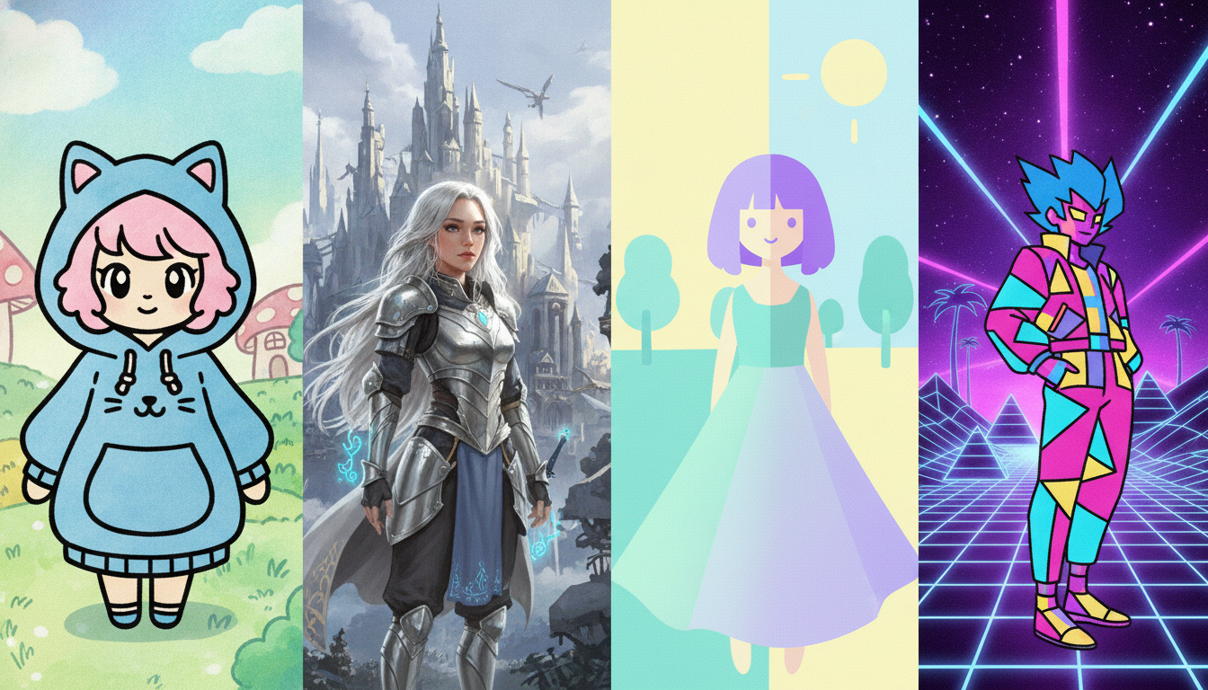
Flip between episodes of Demon Slayer, One Piece, and Neon Genesis Evangelion in a single afternoon, and you might find it hard to believe they all belong to the same medium. One show dazzles with hyper-detailed water-and-flame effects that look like they were painted by a Renaissance master with a GPU. Another leans into rubbery, exaggerated proportions that feel closer to a Saturday-morning cartoon. The third strips everything down to sparse, haunting linework that somehow communicates more existential dread than a hundred Hollywood blockbusters. Welcome to anime — a world where “art style” is not a single thing but an entire universe of deliberate visual choices.
What makes this especially fascinating is that those differences are almost never accidental. Every brushstroke, color palette, eye shape, and body proportion is a coded signal — a language built from decades of studio tradition, directorial ego, budget realities, manga source material, and the specific emotional story a creator is trying to tell. Understanding why these styles diverge so dramatically is essentially understanding how anime thinks. And once you see the system behind the chaos, you’ll never watch a new series without noticing it. That’s the curse, and also the gift.
The Foundational Influence of Osamu Tezuka and the “Big Eyes” Tradition
No conversation about anime art style starts anywhere other than Osamu Tezuka. Often called the “God of Manga,” Tezuka pioneered the large, luminous eye style that became globally synonymous with anime and manga. He drew explicit inspiration from Western animation — particularly Disney — and adapted it for Japanese storytelling in works like Astro Boy (1952 manga, 1963 anime adaptation). Those oversized eyes were a deliberate tool: eyes convey emotion faster and more universally than almost any other facial feature, and Tezuka needed his characters to communicate across panels with maximum expressiveness.
That tradition cascaded forward for decades. Studios and artists who grew up on Tezuka’s work carried his visual language into their own projects, which is why even today you’ll find that wide, reflective eyes remain a baseline default across shōnen and shōjo anime. But it’s also why deliberate departures from that baseline — like the comparatively realistic and restrained character designs in Monster (Naoki Urasawa’s psychological thriller) — immediately feel striking and intentional. Breaking the Tezuka rule is itself a stylistic statement.
How Source Material Shapes Visual Identity
A massive driver of visual divergence is the original manga or light novel an anime adapts. When a studio takes on a project, they are, in most cases, committing to translate an existing artist’s unique linework and visual sensibility into motion. That creates a fascinating chain of translation.
Eiichiro Oda’s One Piece, for instance, features intentionally exaggerated, almost grotesque proportions — massive fists, impossibly long necks, wild silhouettes — because Oda wanted a world that felt visually absurd and boundless. Toei Animation, which has produced the anime since 1999, had to carry that aesthetic forward across thousands of episodes. Meanwhile, Koyoharu Gotouge’s Demon Slayer manga featured softer, more intricate panel work with heavy emphasis on natural textures, and studio Ufotable ran with that in a completely different direction — building one of the most technically elaborate animation pipelines in modern anime history to honor it.
Then there are original anime (not based on prior manga), where directors have complete visual freedom. Hideaki Anno’s Neon Genesis Evangelion (1995–1996) is the legendary example: Anno and character designer Yoshiyuki Sadamoto built a deliberately desolate, angular aesthetic that mirrored the show’s themes of psychological collapse. No source material constraints — just pure directorial vision bleeding into every frame.
Studio Identity: The Invisible Signature on Every Frame
Even before you see the opening credits, veteran fans can often identify which studio made something just by watching thirty seconds of footage. Studio house styles are that distinct.
- Ufotable is famous for seamlessly blending 2D and 3D CGI with rich particle effects — visible in Demon Slayer and the Fate franchise.
- Madhouse (behind Hunter x Hunter, Death Note, Trigun) favors clean, controlled linework with precise shading and a grounded color palette.
- Studio Ghibli (Hayao Miyazaki, Isao Takahata) built its entire identity on lush, hand-painted backgrounds and naturalistic movement — a direct philosophical rejection of shortcut animation techniques.
- Trigger (formed by former Gainax staff) embraces loud, kinetic, intentionally “off-model” energy — Kill la Kill and Gurren Lagann essentially weaponize stylistic chaos.
- MAPPA, the studio behind Jujutsu Kaisen and Chainsaw Man, blends hyper-detailed action sequences with bold, angular character designs that feel almost Western-comics-adjacent.
These aren’t just vibes — they’re organizational cultures built around specific technical philosophies, hiring preferences, and the aesthetic priorities of key directors and animators.
Color, Shading, and the Emotional Grammar of a Palette
Style isn’t just about shape — color and shading do enormous heavy lifting. Compare the sun-bleached, washed-out palette of Vinland Saga (reinforcing its brutal Viking-age bleakness) with the jewel-bright, hyper-saturated world of Fullmetal Alchemist: Brotherhood. Both are serious stories dealing with war and loss, but their color languages tell you immediately that you’re in different emotional registers.
Lighting and shading techniques have also evolved into their own subcategories. Cel shading — the flat, hard-edged shading style that mimics traditional animation cels — remains an artistic choice even now that digital tools dominate production. Sakuga (the fan term for sequences of exceptionally fluid, high-quality animation, often by a standout individual animator) creates moments where the style noticeably elevates, drawing extra attention to a climactic fight or emotional scene. Noticing sakuga moments is one of the deeper pleasures of being a seasoned anime fan — it’s like catching a jazz musician improvise something extraordinary mid-song.
Genre Conventions and the Visual Codes You’ve Already Learned Without Knowing It
Anime genres have developed their own visual dialects so consistently that they function almost like contracts with the audience.
- Shōnen (aimed at young male audiences): Bold outlines, dynamic action poses, expressive face-faults and sweat drops, power-up transformation sequences with signature lighting.
- Shōjo (aimed at young female audiences): Softer linework, elaborate floral and sparkle motifs, highly detailed hair, elongated delicate features — think Sailor Moon or Fruits Basket.
- Seinen (older male audiences): Often more subdued palettes, realistic proportions, harder shadows — Berserk and Vagabond are textbook examples.
- Moe aesthetic: A specific sub-style prioritizing cute, softly drawn characters with very large eyes, small mouths, and pastel color associations — hugely influential across many genres since the 2000s.
These genre codes are so deeply embedded that deliberately mixing them becomes a storytelling tool. When Madoka Magica (2011) presented its story with pastel shōjo aesthetics and then subverted audience expectations with genuinely dark content, the contrast between the art style and the narrative was the point. The cute visuals were a trap, and the show knew it.
If you want to see how radically different visual philosophies can produce equally iconic results, just browse through these anime movies ranked — it’s a masterclass in how much aesthetic range the medium actually contains.
Technology, Budget, and the Evolution of What’s Visually Possible
The technical reality of what animation studios can afford and build has always shaped style. Early TV anime famously developed techniques to reduce frame count — limited animation, static backgrounds, strategic reuse of footage — partly out of necessity. Over decades, those constraints became aesthetic traditions. Today, digital tools and compositing software have radically expanded what’s possible, allowing studios like Ufotable to achieve effects that would have been prohibitively expensive ten years ago.
CGI integration remains a contentious frontier. Fully 3D anime (Land of the Lustrous, 2017) can achieve a genuinely distinct and beautiful aesthetic. But CGI characters dropped into traditionally animated shows still occasionally produce jarring visual dissonance — the so-called “CGI crowd” problem, where background characters rendered in 3D look noticeably alien next to 2D principals. The discourse around CGI in anime is, appropriately, one of the most passionate in fan communities right now in 2026.
Why the Diversity of Anime Art Styles Is Actually Its Greatest Strength
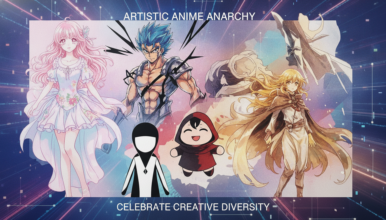
Here’s the bottom line: anime’s visual diversity is not a bug — it’s the entire feature. Because there is no single “correct” anime look, creators have enormous freedom to build a visual language that serves their specific story. The grotesque serves Oda. The sparse serves Anno. The lush serves Miyazaki. Each choice is an argument about what stories look like when they are felt, not just watched.
And that’s what separates anime from almost any other visual storytelling medium at scale. When you understand why Chainsaw Man looks nothing like My Neighbor Totoro, you’re not just absorbing trivia — you’re learning to read a visual language that millions of artists and animators have spent the last seven decades building, one deliberate frame at a time. Pay attention. It’s all saying something.
