
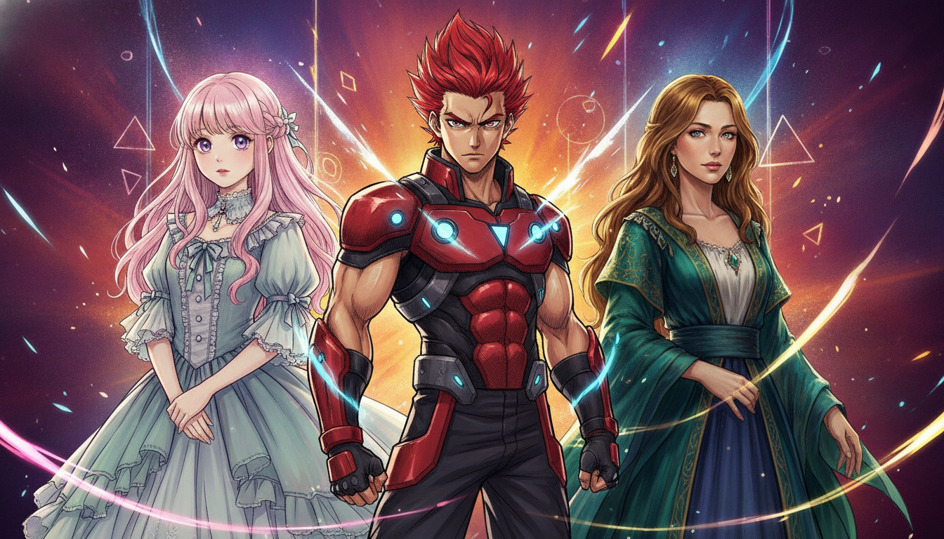
You can identify a Studio Ghibli film within seconds — the lush watercolor backgrounds, the soft character outlines, the way grass seems to breathe in the wind. Flip over to Demon Slayer: Kimetsu no Yaiba and your eyes are hit with hyper-detailed flame effects and bold ink lines that feel like a woodblock print exploding into motion. Then there’s One Punch Man, where Saitama’s deliberately goofy, simple face transforms into jaw-dropping realism the moment he gets serious. All three are anime, all three are unmistakably different — and that’s precisely what makes anime one of the most visually diverse storytelling mediums on the planet.
Unlike Western animation, which often gravitates toward a unified “house style” within studios, Japanese anime has fractured into dozens of distinct visual languages over its decades-long history. These styles aren’t just aesthetic choices; they carry emotional meaning, cultural references, and even economic decisions baked into every line and color choice. The way a character’s eyes are drawn can telegraph the era a show was made in, the target demographic, and even the studio’s budget. It’s a rich visual grammar that fans learn almost subconsciously — but breaking it down consciously is a seriously rewarding rabbit hole.
Whether you’re a lifelong otaku or someone who just started watching anime in 2026 thanks to a friend’s insistent recommendation, understanding what separates these art styles will transform how you watch. You’ll stop seeing “anime” as a monolith and start seeing a universe of deliberate artistic decisions. Let’s decode the biggest ones.
The Classic Shōnen Look: Bold, Dynamic, and Built for Action
Shōnen anime — stories aimed at young male audiences — developed a visual style built around legibility during chaotic action. Think Dragon Ball Z, Naruto, or Bleach. The character designs tend to feature:
- Strong, angular jawlines and defined musculature
- Simplified backgrounds during fight sequences to keep attention on movement
- Exaggerated speed lines (called sakuga effects when animated masterfully)
- Spiky or dramatically styled hair that doubles as visual shorthand for personality
The hair especially is legendary. Goku’s Super Saiyan transformation is recognized worldwide partly because that golden, gravity-defying spike cluster is an instant symbol. Studios like Toei Animation, which has been producing shōnen hits since the 1980s, mastered the art of communicating power through silhouette alone. When your protagonist’s outline can be recognized from fifty meters away on a merchandise shelf, the character design has done its job.
Modern shōnen has evolved these conventions. Jujutsu Kaisen, produced by MAPPA, adds a painterly, almost impressionistic quality to its curse designs while keeping the clean character linework. It’s a layered approach — familiar enough to feel comfortable, strange enough to feel dangerous.
Shōjo Style: Expressive Eyes and the Language of Feeling
If shōnen art is built for impact, shōjo art — aimed traditionally at young female audiences — is built for emotional resonance. The style pioneered by manga artists in the 1970s and refined ever since prioritizes:
- Enormous, luminous eyes with multiple highlight points (those little white dots aren’t random — they reflect emotional intensity)
- Softer, rounder facial features with delicate linework
- Floral and sparkle motifs layered into backgrounds to externalize feelings
- Fashion and fabric rendered in extraordinary detail
Series like Cardcaptor Sakura (produced by Madhouse) and Sailor Moon (Toei Animation) are textbook examples. The eyes in shōjo work essentially function as emotional meters — when Usagi cries in Sailor Moon, those massive irises shimmer and distort in ways that are genuinely affecting. It’s melodrama as visual design philosophy.
Contemporary series like Yona of the Dawn or the acclaimed Fruits Basket remake from TMS Entertainment (which concluded in 2021) show how shōjo aesthetics have matured, adding darker tones and more nuanced facial expressions without abandoning the emotional directness the style is built on.
Studio Ghibli’s Signature World: Nature as a Living Character
It would be impossible to discuss anime art styles without dedicating serious attention to Studio Ghibli. Founded in 1985 by Hayao Miyazaki and Isao Takahata, Ghibli didn’t just develop a visual style — it developed a visual philosophy. The defining characteristics include:
- Watercolor-influenced background art of almost painterly beauty
- Careful, loving depictions of food, architecture, and natural environments
- Character designs that prioritize expressiveness over conventional beauty
- A deliberate rhythm to movement — characters breathe, fidget, and inhabit space
Miyazaki’s insistence on hand-drawn animation even as the industry moved toward digital production gave Ghibli films a warmth that’s genuinely difficult to replicate. Spirited Away (2001) and Princess Mononoke (1997) feature backgrounds so detailed they function as independent artworks. The studio’s 2023 feature The Boy and the Heron, which became Miyazaki’s second Academy Award-winning film (following Spirited Away), proved that this philosophy still resonates powerfully with global audiences in the mid-2020s.
For a deep dive into how drastically anime studios can diverge visually, check out this exploration of why iconic anime art styles look so wildly different — it’s a great companion read.
The Ufotable Effect: Cinematic Lighting and Digital Paintwork
No conversation about modern anime art styles is complete without discussing Ufotable, the studio that essentially redefined audience expectations for TV animation with Fate/Zero (2011–2012) and then shattered those expectations again with Demon Slayer.
Ufotable’s signature approach blends traditional 2D character animation with digitally composited backgrounds and effects that look closer to concept art from a major film production than a weekly TV series. The results:
- Characters rendered in clean, traditional linework placed against richly textured digital environments
- Elemental effects — fire, water, lightning — treated as full artistic setpieces rather than budget shortcuts
- Dynamic camera angles borrowed from live-action cinematography
- Color grading that shifts entire palettes to match emotional tone
The “Flame Breathing” sequences in Demon Slayer became a genuine cultural moment precisely because they showed TV anime could achieve theatrical visual quality on a regular episode schedule. It raised the bar for the entire industry and helped push anime’s global mainstream breakthrough in the early 2020s.
Retro and Alternative Styles: From Osamu Tezuka to Avant-Garde
Not all anime aims for spectacular polish. Some of the most artistically significant anime deliberately embrace older or unconventional aesthetics.
Osamu Tezuka, often called the “Godfather of Manga,” developed a style in the mid-20th century heavily influenced by Disney animation — large eyes, expressive cartoon physics, and a clear visual line from Western animation traditions. His Astro Boy (1963) established conventions that echo through anime to this day, making him a foundational figure anyone interested in anime history should know.
On the experimental end, studios like Science SARU (co-founded by Masaaki Yuasa) have pushed anime into territory that feels closer to abstract expressionism. Keep Your Hands Off Eizouken! (2020) and Ping Pong The Animation (2014) use deliberately rough, loose linework and distorted proportions to create emotional and kinetic energy that slicker productions can’t match. It’s the visual equivalent of jazz improvisation versus classical performance — both valid, both requiring extraordinary skill.
There are also series like Witch Hat Atelier, where the manga’s intricate, European-influenced illustration style presents fascinating challenges for anime adaptation — a perfect case study in how source material aesthetics shape animation decisions.
Key Visual Differences at a Glance
| Style / Approach | Key Visual Traits | Notable Example |
|---|---|---|
| Classic Shōnen | Bold lines, action-focused, expressive hair | Naruto, Dragon Ball Z |
| Shōjo | Luminous large eyes, floral motifs, soft palettes | Sailor Moon, Fruits Basket |
| Ghibli / Painterly | Watercolor backgrounds, naturalistic movement | Spirited Away, My Neighbor Totoro |
| Ufotable / Digital Cinematic | Layered effects, cinematic lighting | Demon Slayer, Fate/Zero |
| Avant-Garde / Experimental | Loose linework, abstract composition | Ping Pong, Eizouken |
| Tezuka Legacy / Retro | Large eyes, cartoon physics, Disney influence | Astro Boy |
Why Art Style Is Never Just Decoration
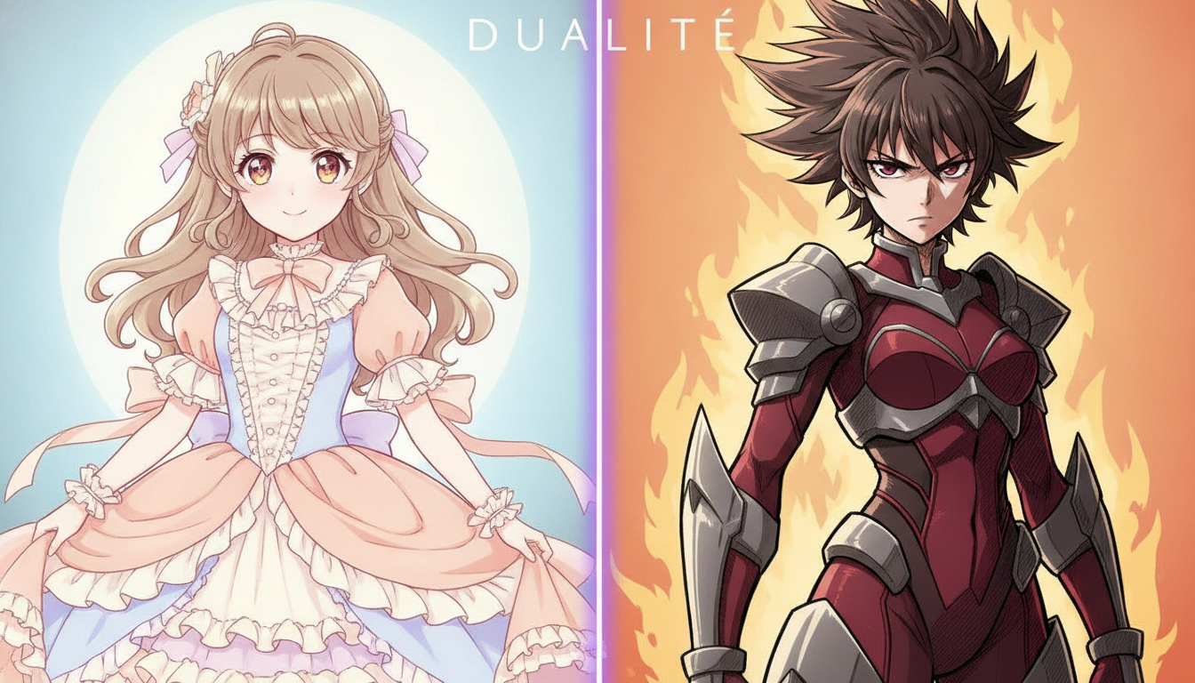
Here’s the thing that ties all of this together: anime art styles are never arbitrary. Every choice — from the number of highlight dots in a character’s eye to whether backgrounds are detailed or deliberately sparse — communicates something. Genre expectations, emotional register, cultural reference points, production philosophy, and target audience are all encoded visually before a single line of dialogue is spoken.
As anime continues its dominance of global pop culture through 2026 and beyond, with streaming platforms commissioning original productions from studios worldwide, these visual languages are cross-pollinating in fascinating ways. Korean, Chinese, and even Western studios are absorbing and remixing anime aesthetics, creating hybrid styles that expand the vocabulary further.
Learning to read art styles doesn’t just make you a more informed fan — it makes every frame of animation more rewarding to watch. The next time a scene stops you cold with its beauty or its weirdness, you’ll know exactly which visual tradition it’s speaking from. And that’s a superpower no wiki can fully replace.

2 Comments
Pingback: One Piece Final Saga Explained So Beginners Get Hooked Fast - ICL Geek Curiosities
Pingback: These Romance Anime Will Absolutely Destroy You Emotionally - ICL Geek Curiosities